Accessibility
Ensuring apps are accessible to a broad range of users is an essential part of building a high-quality app. Applications that are poorly designed create barriers to people of all ages. The UN Convention on the Rights of Persons with Disabilities states the moral and legal imperative to ensure universal access to information systems; countries around the world enforce accessibility as a requirement; and companies recognize the business advantages of maximizing access to their services.
We strongly encourage you to include an accessibility checklist as a key criteria before shipping your app. Flutter is committed to supporting developers in making their apps more accessible, and includes first-class framework support for accessibility in addition to that provided by the underlying operating system, including:
- Large fonts
- Render text widgets with user-specified font sizes
- Screen readers
- Communicate spoken feedback about UI contents
- Sufficient contrast
- Render widgets with colors that have sufficient contrast
Details of these features are discussed below.
Inspecting accessibility support
In addition to testing for these specific topics, we recommend using automated accessibility scanners:
- For Android:
- Install the Accessibility Scanner for Android
- Enable the Accessibility Scanner from Android Settings > Accessibility > Accessibility Scanner > On
- Navigate to the Accessibility Scanner ‘checkbox’ icon button to initiate a scan
- For iOS:
- Open the
iOSfolder of your Flutter app in Xcode - Select a Simulator as the target, and click Run button
- In Xcode, select Xcode > Open Developer Tools > Accessibility Inspector
- In the Accessibility Inspector, select Inspection > Enable Point to Inspect, and then select the various user interface elements in running Flutter app to inspect their accessibility attributes
- In the Accessibility Inspector, select Audit in the toolbar, and then select Run Audit to get a report of potential issues
- Open the
- For web:
- Open Chrome DevTools (or similar tools in other browsers)
- Inspect the HTML tree containing the ARIA attributes generated by Flutter.
- In Chrome, the “Elements” tab has a “Accessbility” sub-tab that can be used to inspect the data exported to semantics tree
Large fonts
Both Android and iOS contain system settings to configure the desired font sizes used by apps. Flutter text widgets respect this OS setting when determining font sizes.
Font sizes are calculated automatically by Flutter based on the OS setting. However, as a developer you should make sure your layout has enough room to render all its contents when the font sizes are increased. For example, you can test all parts of your app on a small-screen device configured to use the largest font setting.
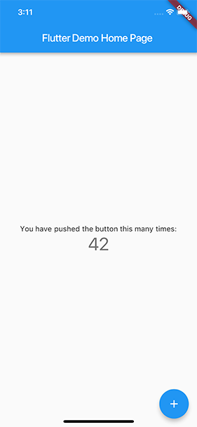
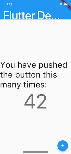
Example
The following two screenshots show the standard Flutter app template rendered with the default iOS font setting, and with the largest font setting selected in iOS accessibility settings.
Screen readers
For mobile, screen readers (TalkBack, VoiceOver) enable visually impaired users to get spoken feedback about the contents of the screen and interact with the UI via gestures on mobile and keyboard shortcuts on desktop. Turn on VoiceOver or TalkBack on your mobile device and navigate around your app.
For web, the following screen readers are currently supported:
Mobile Browsers:
- iOS - VoiceOver
- Android - TalkBack
Desktop Browsers:
- MacOS - VoiceOver
- Windows - JAWs & NVDA
Screen Readers users on web will need to toggle “Enable accessibility” button to build the semantics tree. Users can skip this step if you programmatically auto-enable accessibility for your app using this API:
RendererBinding.instance.setSemanticsEnabled(true)
Check out this video demo to see Victor Tsaran, who leads the Accessibility program for Material Design, using VoiceOver with the Flutter Gallery web app.
Flutter’s standard widgets generate an accessibility tree automatically.
However, if your app needs something different, it can be customized
using the Semantics widget.
Sufficient contrast
Sufficient color contrast makes text and images easier to read. Along with benefitting users with various visual impairments, sufficient color contrast helps all users when viewing an interface on devices in extreme lighting conditions, such as when exposed to direct sunlight or on a display with low brightness.
The W3C recommends:
- At least 4.5:1 for small text (below 18 point regular or 14 point bold)
- At least 3.0:1 for large text (18 point and above regular or 14 point and above bold)
Building with accessibility in mind
Ensuring your app can be used by everyone means building accessibility into it from the start. For some apps, that’s easier said than done. In the video below, two of our engineers take a mobile app from a dire accessibility state to one that takes advantage of Flutter’s built-in widgets to offer a dramatically more accessible experience.
Testing accessibility on web:
You can debug accessibility by visualizing the semantic nodes created for your web app using the following command line flag in profile and release modes:
$ flutter run -d chrome --profile \
 --dart-define=FLUTTER_WEB_DEBUG_SHOW_SEMANTICS=true
With the flag activated, the semantic nodes appear on top of the widgets; you can verify that the semantic elements are placed where they should be. If the semantic nodes are incorrectly placed, please file a bug report.
Accessibility release checklist
Here is a non-exhaustive list of things to consider as you prepare your app for release.
-
Active interactions. Ensure that all active interactions do
something. Any button that can
be pushed should do something when pushed. For example, if you have a
no-op callback for an
onPressedevent, change it to show aSnackBaron the screen explaining which control you just pushed. - Screen reader testing. The screen reader should be able to describe all controls on the page when you tap on them, and the descriptions should be intelligible. Test your app with TalkBack (Android) and VoiceOver (iOS).
- Contrast ratios. We encourage you to have a contrast ratio of at least 4.5:1 between controls or text and the background, with the exception of disabled components. Images should also be vetted for sufficient contrast.
- Context switching. Nothing should change the user’s context automatically while typing in information. Generally, the widgets should avoid changing the user’s context without some sort of confirmation action.
- Tappable targets. All tappable targets should be at least 48x48 pixels.
- Errors. Important actions should be able to be undone. In fields that show errors, suggest a correction if possible.
- Color vision deficiency testing. Controls should be usable and legible in colorblind and grayscale modes.
- Scale factors. The UI should remain legible and usable at very large scale factors for text size and display scaling.
More information
For more information, particularly about how to configure the semantics tree, see the following articles written by community members: