Create a shimmer loading effect
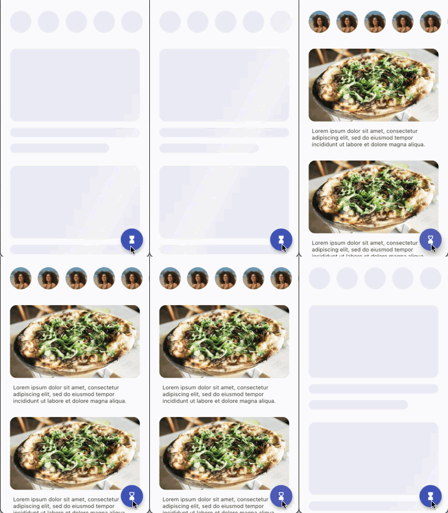
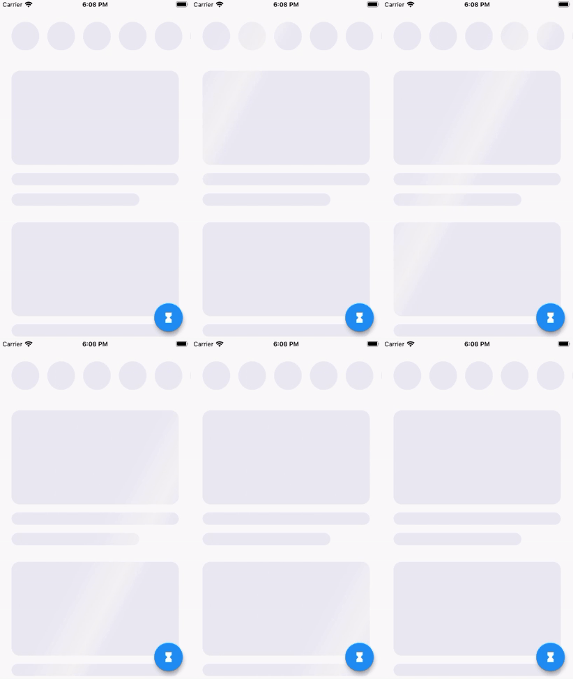
Loading times are unavoidable in application development. From a user experience (UX) perspective, the most important thing is to show your users that loading is taking place. One popular approach to communicate to users that data is loading is to display a chrome color with a shimmer animation over the shapes that approximate the type of content that is loading.
The following animation shows the app’s behavior:

This recipe begins with the content widgets defined and positioned. There is also a Floating Action Button (FAB) in the bottom-right corner that toggles between a loading mode and a loaded mode so that you can easily validate your implementation.
Draw the shimmer shapes
The shapes that shimmer in this effect are independent from the actual content that eventually loads.
Therefore, the goal is to display shapes that represent the eventual content as accurately as possible.
Displaying accurate shapes is easy in situations where the content has a clear boundary. For example, in this recipe, there are some circular images and some rounded rectangle images. You can draw shapes that precisely match the outlines of those images.
On the other hand, consider the text that appears beneath the rounded rectangle images. You won’t know how many lines of text exist until the text loads. Therefore, there is no point in trying to draw a rectangle for every line of text. Instead, while the data is loading, you draw a couple of very thin rounded rectangles that represent the text that will appear. The shape and size doesn’t quite match, but that is OK.
Start with the circular list items at the top of the screen.
Ensure that each CircleListItem widget displays a circle
with a color while the image is loading.
class CircleListItem extends StatelessWidget {
 @override
 Widget build(BuildContext context) {
   return Padding(
     padding: const EdgeInsets.symmetric(horizontal: 8, vertical: 8),
     child: Container(
       width: 54,
       height: 54,
       decoration: const BoxDecoration(
         color: Colors.black,
         shape: BoxShape.circle,
       ),
       child: ClipOval(
         child: Image.network(
           'https://flutter'
           '.dev/docs/cookbook/img-files/effects/split-check/Avatar1.jpg',
           fit: BoxFit.cover,
         ),
       ),
     ),
   );
 }
}
As long as your widgets display some kind of shape, you can apply the shimmer effect in this recipe.
Similar to the CircleListItem widgets,
ensure that the CardListItem widgets
display a color where the image will appear.
Also, in the CardListItem widget,
switch between the display of the text and
the rectangles based on the current loading status.
class CardListItem extends StatelessWidget {
 const CardListItem({
   Key? key,
   required this.isLoading,
 }) : super(key: key);

 final bool isLoading;

 @override
 Widget build(BuildContext context) {
   return Padding(
     padding: const EdgeInsets.symmetric(horizontal: 24, vertical: 16),
     child: Column(
       crossAxisAlignment: CrossAxisAlignment.start,
       children: [
         _buildImage(),
         const SizedBox(height: 16),
         _buildText(),
       ],
     ),
   );
 }

 Widget _buildImage() {
   return AspectRatio(
     aspectRatio: 16 / 9,
     child: Container(
       width: double.infinity,
       decoration: BoxDecoration(
         color: Colors.black,
         borderRadius: BorderRadius.circular(16),
       ),
       child: ClipRRect(
         borderRadius: BorderRadius.circular(16),
         child: Image.network(
           'https://flutter'
           '.dev/docs/cookbook/img-files/effects/split-check/Food1.jpg',
           fit: BoxFit.cover,
         ),
       ),
     ),
   );
 }

 Widget _buildText() {
   if (isLoading) {
     return Column(
       crossAxisAlignment: CrossAxisAlignment.start,
       children: [
         Container(
           width: double.infinity,
           height: 24,
           decoration: BoxDecoration(
             color: Colors.black,
             borderRadius: BorderRadius.circular(16),
           ),
         ),
         const SizedBox(height: 16),
         Container(
           width: 250,
           height: 24,
           decoration: BoxDecoration(
             color: Colors.black,
             borderRadius: BorderRadius.circular(16),
           ),
         ),
       ],
     );
   } else {
     return Padding(
       padding: const EdgeInsets.symmetric(horizontal: 8.0),
       child: Text(
         'Lorem ipsum dolor sit amet, consectetur adipiscing elit, sed do '
         'eiusmod tempor incididunt ut labore et dolore magna aliqua.',
       ),
     );
   }
 }
}
Your UI now renders itself differently depending on whether it’s loading or loaded. By temporarily commenting out the image URLs, you can see the two ways your UI renders.

The next goal is to paint all of the colored areas with a single gradient that looks like a shimmer.
Paint the shimmer gradient
The key to the effect achieved in this recipe is to use a widget
called ShaderMask. The ShaderMask widget, as the name suggests,
applies a shader to its child, but only in the areas where
the child already painted something. For example,
you’ll apply a shader to only the black shapes that you
configured earlier.
Define a chrome-colored, linear gradient that gets applied to the shimmer shapes.
const _shimmerGradient = LinearGradient(
 colors: [
   Color(0xFFEBEBF4),
   Color(0xFFF4F4F4),
   Color(0xFFEBEBF4),
 ],
 stops: [
   0.1,
   0.3,
   0.4,
 ],
 begin: Alignment(-1.0, -0.3),
 end: Alignment(1.0, 0.3),
 tileMode: TileMode.clamp,
);
Define a new stateful widget called ShimmerLoading
that wraps a given child widget with a ShaderMask.
Configure the ShaderMask widget to apply the shimmer
gradient as a shader with a blendMode of srcATop.
The srcATop blend mode replaces any color that your
child widget painted with the shader color.
class ShimmerLoading extends StatefulWidget {
 const ShimmerLoading({
   Key? key,
   required this.isLoading,
   required this.child,
 }) : super(key: key);

 final bool isLoading;
 final Widget child;

 @override
 _ShimmerLoadingState createState() => _ShimmerLoadingState();
}

class _ShimmerLoadingState extends State<ShimmerLoading> {
 @override
 Widget build(BuildContext context) {
   if (!widget.isLoading) {
     return widget.child;
   }

   return ShaderMask(
     blendMode: BlendMode.srcATop,
     shaderCallback: (bounds) {
       return _shimmerGradient.createShader(bounds);
     },
     child: widget.child,
   );
 }
}
Wrap your CircleListItem widgets with a ShimmerLoading widget.
Widget _buildTopRowItem() {
 return ShimmerLoading(
   isLoading: _isLoading,
   child: CircleListItem(),
 );
}
Wrap your CardListItem widgets with a ShimmerLoading widget.
Widget _buildListItem() {
 return ShimmerLoading(
   isLoading: _isLoading,
   child: CardListItem(
     isLoading: _isLoading,
   ),
 );
}
When your shapes are loading, they now display
the shimmer gradient that is
returned from the shaderCallback.
This is a big step in the right direction,
but there’s a problem with this gradient display.
Each CircleListItem widget and each CardListItem widget
displays a new version of the gradient.
For this recipe, the entire screen should
look like one, big shimmering surface.
You solve this problem in the next step.
Paint one big shimmer
To paint one big shimmer across the screen,
each ShimmerLoading widget needs
to paint the same full-screen gradient based
on the position of that ShimmerLoading
widget on the screen.
To be more precise, rather than assume that the shimmer
should take up the entire screen,
there should be some area that shares the shimmer.
Maybe that area takes up the entire screen,
or maybe it doesn’t. The way to solve this
kind of problem in Flutter is to define another widget
that sits above all of the ShimmerLoading widgets
in the widget tree, and call it Shimmer.
Then, each ShimmerLoading widget gets a reference
to the Shimmer ancestor
and requests the desired size and gradient to display.
Define a new stateful widget called Shimmer that
takes in a LinearGradient and provides descendants
with access to its State object.
class Shimmer extends StatefulWidget {
 static ShimmerState? of(BuildContext context) {
   return context.findAncestorStateOfType<ShimmerState>();
 }

 const Shimmer({
   Key? key,
   required this.linearGradient,
   this.child,
 }) : super(key: key);

 final LinearGradient linearGradient;
 final Widget? child;

 @override
 ShimmerState createState() => ShimmerState();
}

class ShimmerState extends State<Shimmer> {
 @override
 Widget build(BuildContext context) {
   return widget.child ?? const SizedBox();
 }
}
Add methods to the ShimmerState class in order
to provide access to the linearGradient,
the size of the ShimmerState’s RenderBox,
and look up the position of a descendant within the
ShimmerState’s RenderBox.
class ShimmerState extends State<Shimmer> {
 Gradient get gradient => LinearGradient(
       colors: widget.linearGradient.colors,
       stops: widget.linearGradient.stops,
       begin: widget.linearGradient.begin,
       end: widget.linearGradient.end,
     );

 bool get isSized => (context.findRenderObject() as RenderBox).hasSize;

 Size get size => (context.findRenderObject() as RenderBox).size;

 Offset getDescendantOffset({
   required RenderBox descendant,
   Offset offset = Offset.zero,
 }) {
   final shimmerBox = context.findRenderObject() as RenderBox;
   return descendant.localToGlobal(offset, ancestor: shimmerBox);
 }

 @override
 Widget build(BuildContext context) {
   return widget.child ?? const SizedBox();
 }
}
Wrap all of your screen’s content with the Shimmer widget.
class _ExampleUiLoadingAnimationState extends State<ExampleUiLoadingAnimation> {
 @override
 Widget build(BuildContext context) {
   return Scaffold(
     body: Shimmer(
       linearGradient: _shimmerGradient,
       child: ListView(...),
     ),
   );
 }
}
Use the Shimmer widget within your
ShimmerLoading widget to paint the shared gradient.
class _ShimmerLoadingState extends State<ShimmerLoading> {
 @override
 Widget build(BuildContext context) {
   if (!widget.isLoading) {
     return widget.child;
   }

   // Collect ancestor shimmer information.
   final shimmer = Shimmer.of(context)!;
   if (!shimmer.isSized) {
     // The ancestor Shimmer widget isn’t laid
     // out yet. Return an empty box.
     return SizedBox();
   }
   final shimmerSize = shimmer.size;
   final gradient = shimmer.gradient;
   final offsetWithinShimmer = shimmer.getDescendantOffset(
     descendant: context.findRenderObject() as RenderBox,
   );

   return ShaderMask(
     blendMode: BlendMode.srcATop,
     shaderCallback: (bounds) {
       return gradient.createShader(
         Rect.fromLTWH(
           -offsetWithinShimmer.dx,
           -offsetWithinShimmer.dy,
           shimmerSize.width,
           shimmerSize.height,
         ),
       );
     },
     child: widget.child,
   );
 }
}
Your ShimmerLoading widgets now display a shared
gradient that takes up all of the space within the
Shimmer widget.
Animate the shimmer
The shimmer gradient needs to move in order to give the appearance of a shimmering shine.
The LinearGradient has a property called transform
that can be used to transform the appearance of the gradient,
for example, to move it horizontally.
The transform property accepts a GradientTransform instance.
Define a class called _SlidingGradientTransform that implements
GradientTransform to achieve the appearance of horizontal sliding.
class _SlidingGradientTransform extends GradientTransform {
 const _SlidingGradientTransform({
   required this.slidePercent,
 });

 final double slidePercent;

 @override
 Matrix4? transform(Rect bounds, {TextDirection? textDirection}) {
   return Matrix4.translationValues(bounds.width * slidePercent, 0.0, 0.0);
 }
}
The gradient slide percentage changes over time
in order to create the appearance of motion.
To change the percentage, configure an
AnimationController in the ShimmerState class.
class ShimmerState extends State<Shimmer> with SingleTickerProviderStateMixin {
 late AnimationController _shimmerController;

 @override
 void initState() {
   super.initState();

   _shimmerController = AnimationController.unbounded(vsync: this)
     ..repeat(min: -0.5, max: 1.5, period: const Duration(milliseconds: 1000));
 }

 @override
 void dispose() {
   _shimmerController.dispose();
   super.dispose();
 }
}
Apply the _SlidingGradientTransform to the gradient
by using the _shimmerController’s value as the slidePercent.
LinearGradient get gradient => LinearGradient(
  colors: widget.linearGradient.colors,
  stops: widget.linearGradient.stops,
  begin: widget.linearGradient.begin,
  end: widget.linearGradient.end,
  transform: _SlidingGradientTransform(slidePercent:
    _shimmerController.value),
);
The gradient now animates, but your individual
ShimmerLoading widgets don’t repaint themselves
as the gradient changes. Therefore, it looks like nothing
is happening.
Expose the _shimmerController from ShimmerState
as a Listenable.
Listenable get shimmerChanges => _shimmerController;
In ShimmerLoading, listen for changes to the ancestor
ShimmerState’s shimmerChanges property,
and repaint the shimmer gradient.
class _ShimmerLoadingState extends State<ShimmerLoading> {
 Listenable? _shimmerChanges;

 @override
 void didChangeDependencies() {
   super.didChangeDependencies();
   if (_shimmerChanges != null) {
     _shimmerChanges!.removeListener(_onShimmerChange);
   }
   _shimmerChanges = Shimmer.of(context)?.shimmerChanges;
   if (_shimmerChanges != null) {
     _shimmerChanges!.addListener(_onShimmerChange);
   }
 }

 @override
 void dispose() {
   _shimmerChanges?.removeListener(_onShimmerChange);
   super.dispose();
 }

 void _onShimmerChange() {
   if (widget.isLoading) {
     setState(() {
       // update the shimmer painting.
     });
   }
 }
}
Congratulations! You now have a full-screen, animated shimmer effect that turns on and off as the content loads.