Cupertino (iOS-style) widgets
Beautiful and high-fidelity widgets for current iOS design language.
See more widgets in the widget catalog.
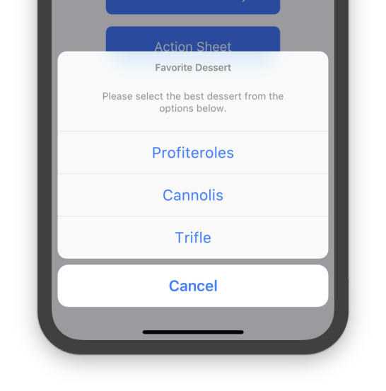
An iOS-style modal bottom action sheet to choose an option among many.

An iOS-style activity indicator. Displays a circular 'spinner'.

An iOS-style alert dialog.
An iOS-style button.
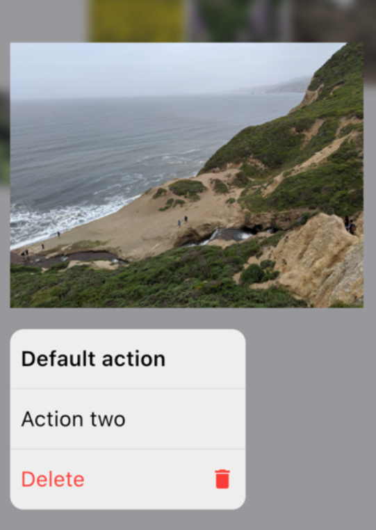
An iOS-style full-screen modal route that opens when the child is long-pressed. Used to display relevant actions for your content.
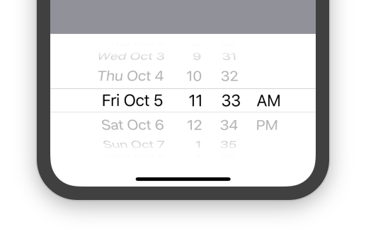
An iOS-style date or date and time picker.
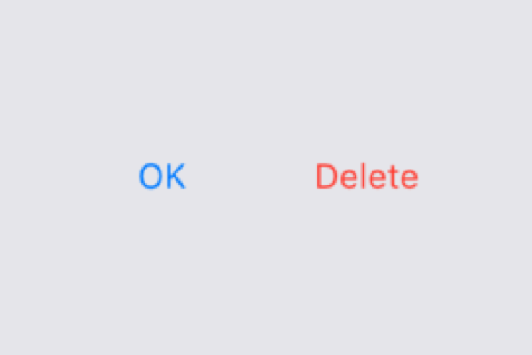
A button typically used in a CupertinoAlertDialog.
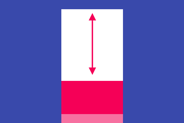
An iOS-style transition used for summoning fullscreen dialogs.

An iOS-style top navigation bar. Typically used with CupertinoPageScaffold.
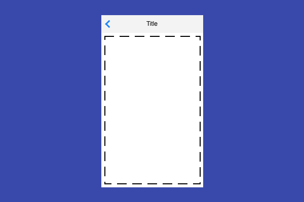
Basic iOS style page layout structure. Positions a navigation bar and content on a background.
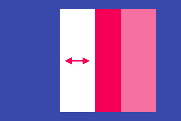
Provides an iOS-style page transition animation.
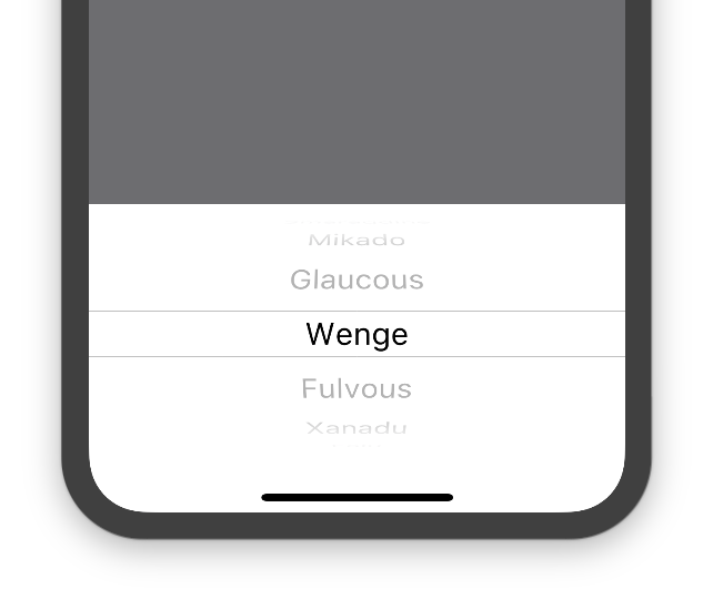
An iOS-style picker control. Used to select an item in a short list.

Rounded rectangle surface that looks like an iOS popup surface, such as an alert dialog or action sheet.
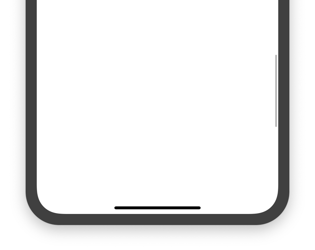
An iOS-style scrollbar that indicates which portion of a scrollable widget is currently visible.

An iOS-style search field.

An iOS-style segmented control. Used to select mutually exclusive options in a horizontal list.

Used to select from a range of values.

An iOS-13-style segmented control. Used to select mutually exclusive options in a horizontal list.
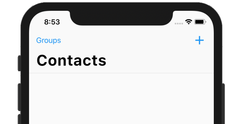
An iOS-styled navigation bar with iOS-11-style large titles using slivers.

An iOS-style switch. Used to toggle the on/off state of a single setting.

An iOS-style bottom tab bar. Typically used with CupertinoTabScaffold.
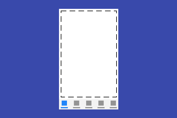
Tabbed iOS app structure. Positions a tab bar on top of tabs of content.
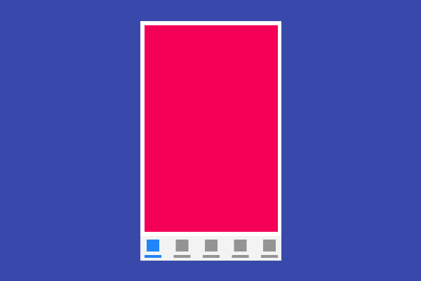
Root content of a tab that supports parallel navigation between tabs. Typically used with CupertinoTabScaffold.
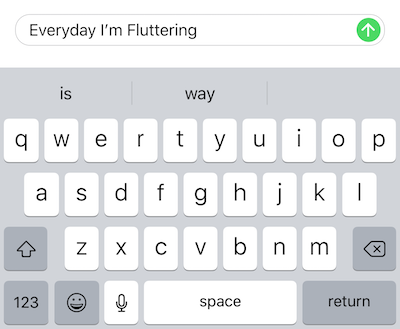
An iOS-style text field.
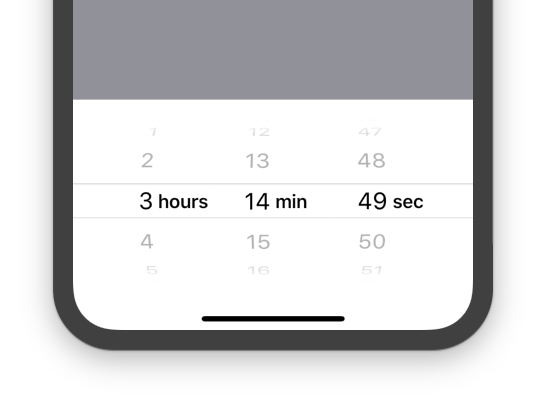
An iOS-style countdown timer picker.
See more widgets in the widget catalog.