Material Components widgets
Visual, behavioral, and motion-rich widgets implementing the Material Design guidelines.
- App structure and navigation
- Buttons
- Input and selections
- Dialogs, alerts, and panels
- Information displays
- Layout
See more widgets in the widget catalog.
App structure and navigation
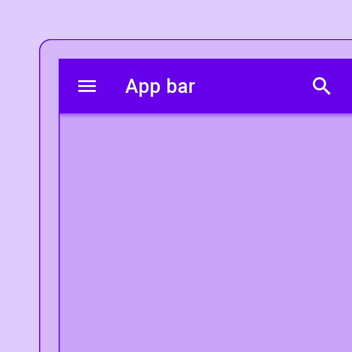
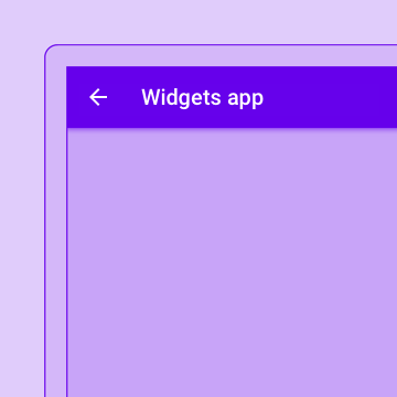
A Material Design app bar. An app bar consists of a toolbar and potentially other widgets, such as a TabBar and a FlexibleSpaceBar.
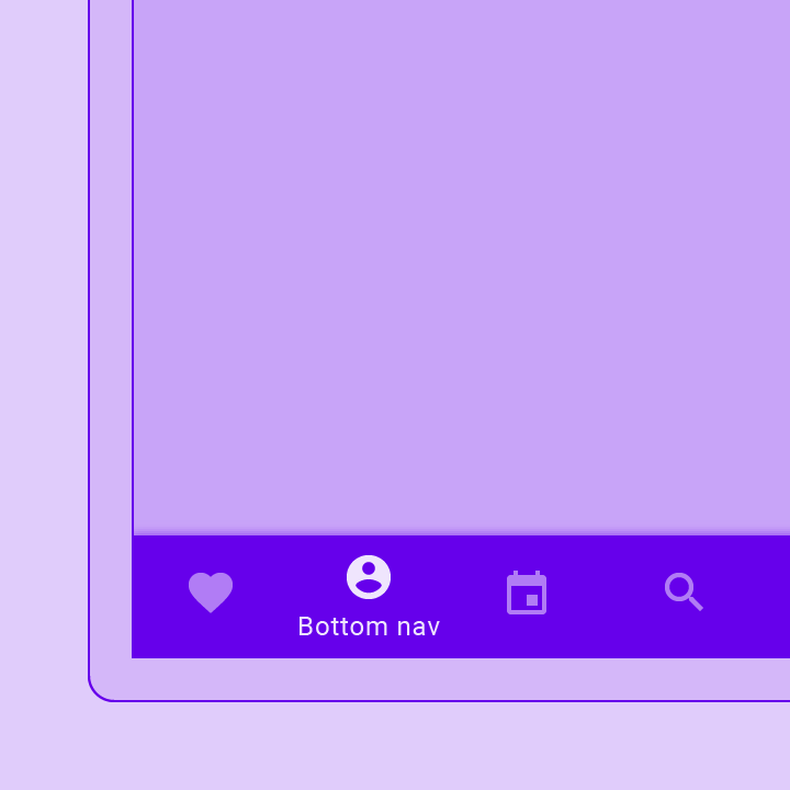
Bottom navigation bars make it easy to explore and switch between top-level views in a single tap. The BottomNavigationBar widget implements this component.
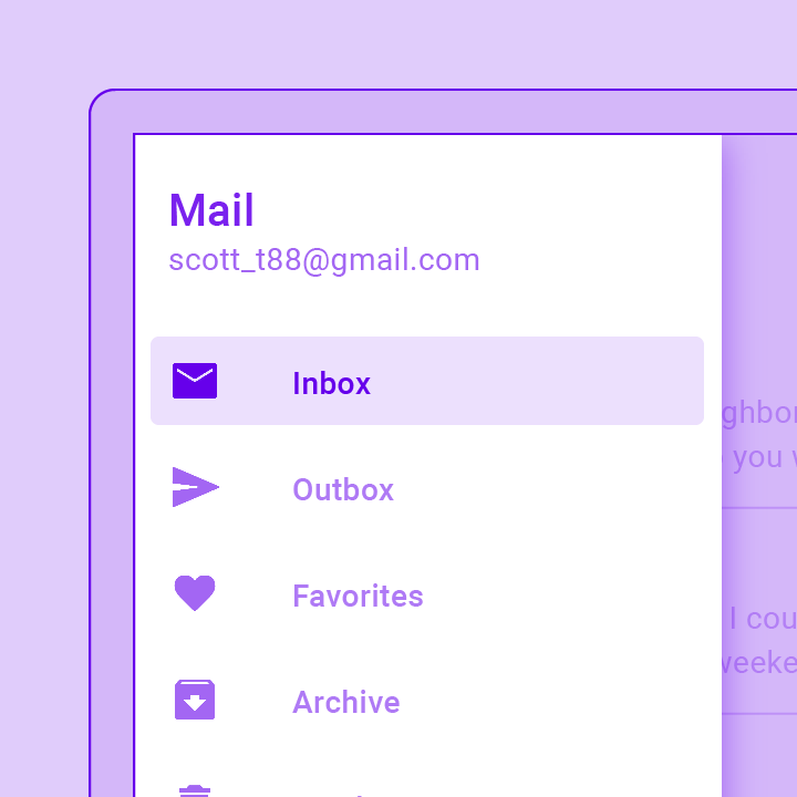
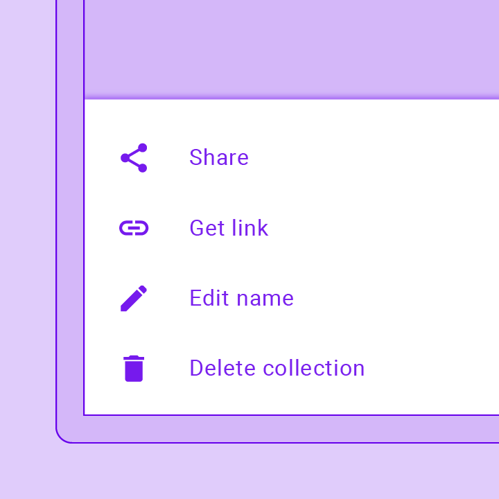
A Material Design panel that slides in horizontally from the edge of a Scaffold to show navigation links in an application.
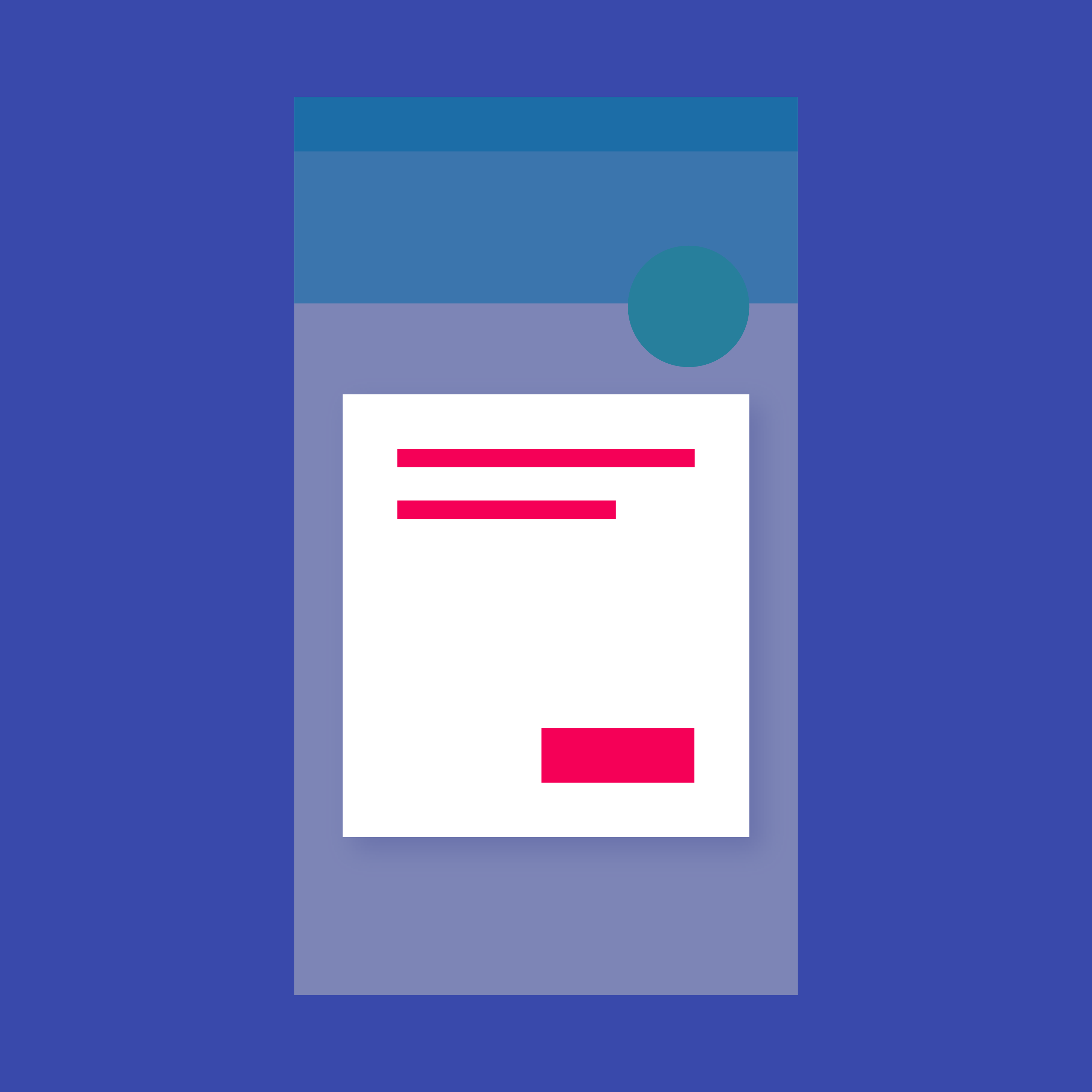
A convenience widget that wraps a number of widgets that are commonly required for applications implementing Material Design.
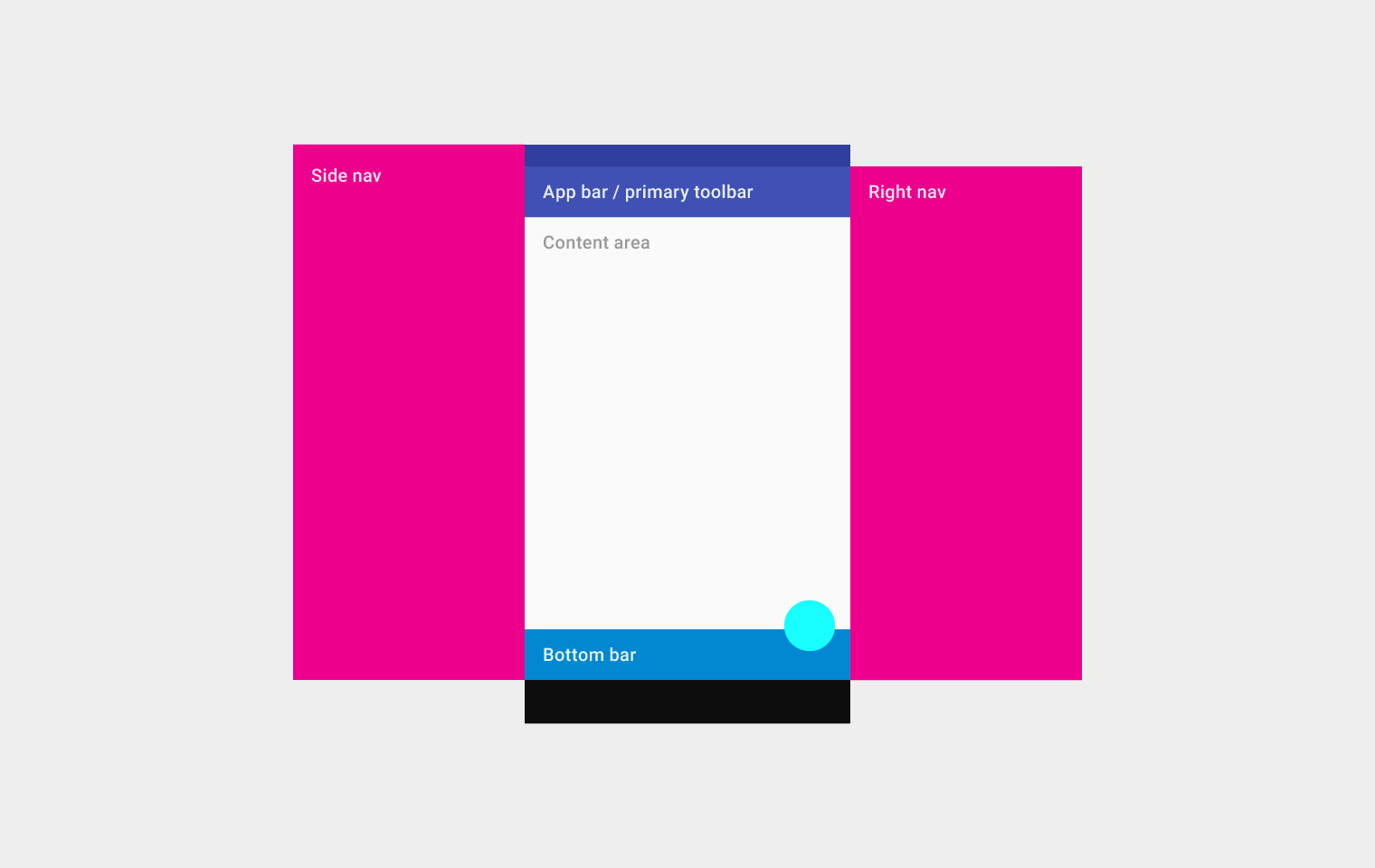
Implements the basic Material Design visual layout structure. This class provides APIs for showing drawers, snack bars, and bottom sheets.
A material design app bar that integrates with a CustomScrollView.
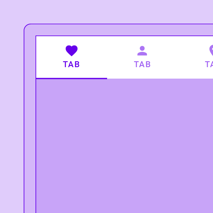
A Material Design widget that displays a horizontal row of tabs.
A page view that displays the widget which corresponds to the currently selected tab. Typically used in conjunction with a TabBar.
Coordinates tab selection between a TabBar and a TabBarView.
Displays a row of small circular indicators, one per tab. The selected tab's indicator is highlighted. Often used in conjunction with a TabBarView.
A convenience class that wraps a number of widgets that are commonly required for an application.
Buttons
Shows the currently selected item and an arrow that opens a menu for selecting another item.
A Material Design elevated button. A filled button whose material elevates when pressed.
A floating action button is a circular icon button that hovers over content to promote a primary action in the application. Floating action buttons are...
An icon button is a picture printed on a Material widget that reacts to touches by filling with color (ink).
A Material Design outlined button, essentially a TextButton with an outlined border.
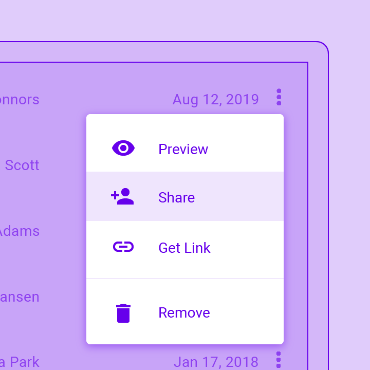
Displays a menu when pressed and calls onSelected when the menu is dismissed because an item was selected.
A Material Design text button. A simple flat button without a border outline.
Input and selections
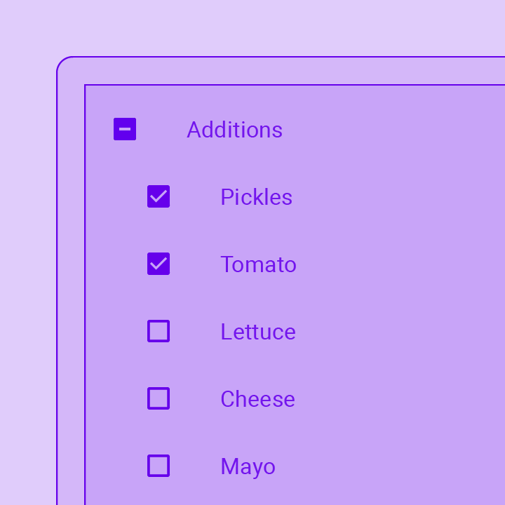
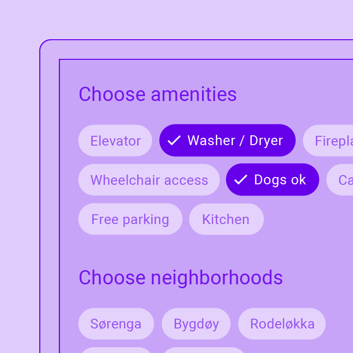
Checkboxes allow the user to select multiple options from a set. The Checkbox widget implements this component.

Date pickers use a dialog window to select a single date on mobile. Time pickers use a dialog to select a single time (in the...
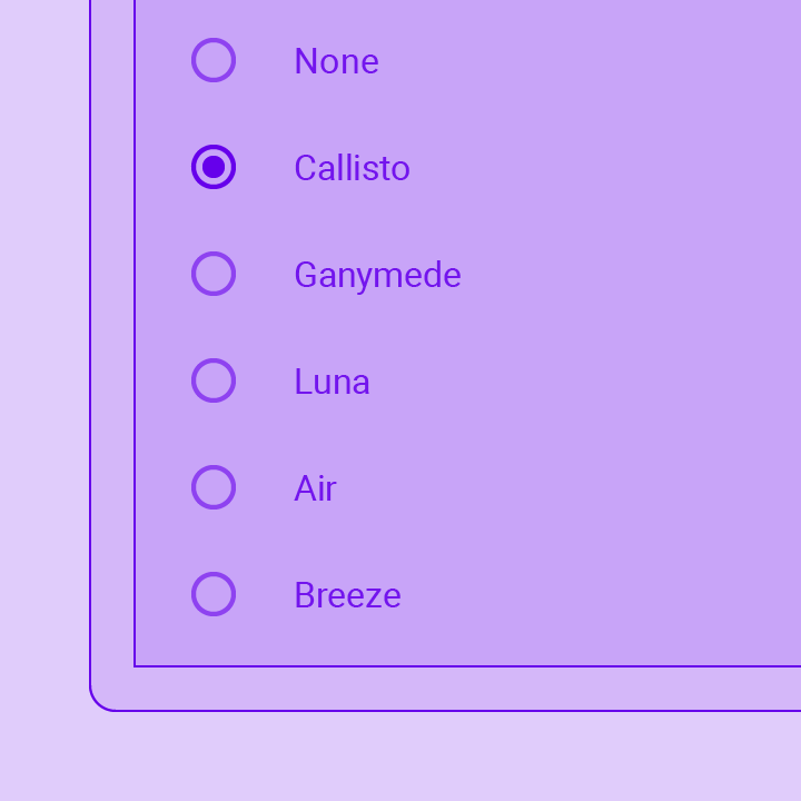
Radio buttons allow the user to select one option from a set. Use radio buttons for exclusive selection if you think that the user needs...
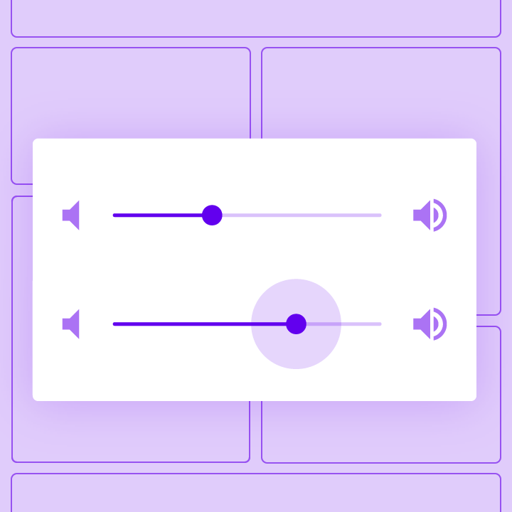
Sliders let users select from a range of values by moving the slider thumb.
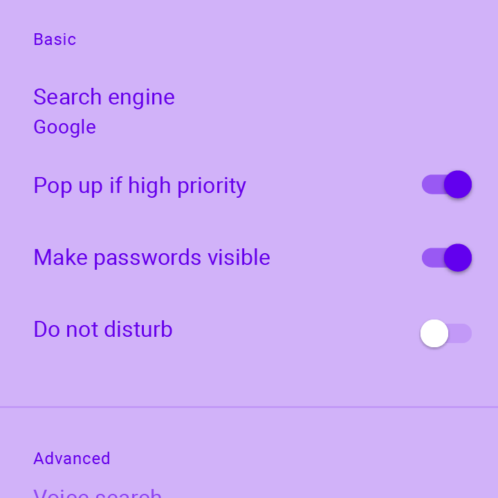
On/off switches toggle the state of a single settings option. The Switch widget implements this component.
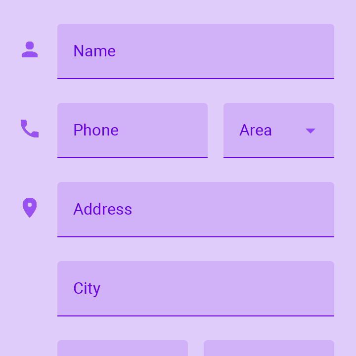
Touching a text field places the cursor and displays the keyboard. The TextField widget implements this component.
Dialogs, alerts, and panels
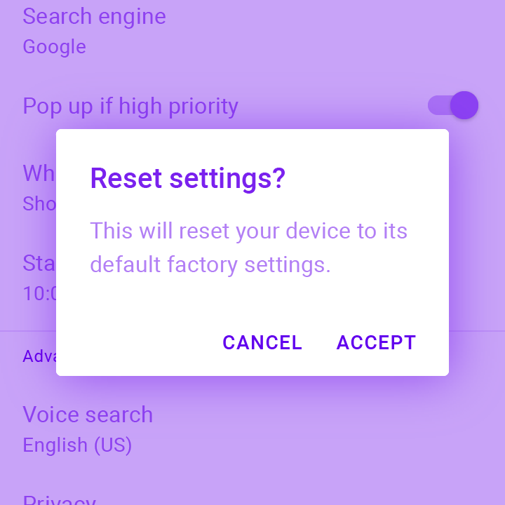
Alerts are urgent interruptions requiring acknowledgement that inform the user about a situation. The AlertDialog widget implements this component.
Bottom sheets slide up from the bottom of the screen to reveal more content. You can call showBottomSheet() to implement a persistent bottom sheet or...

Expansion panels contain creation flows and allow lightweight editing of an element. The ExpansionPanel widget implements this component.
Simple dialogs can provide additional details or actions about a list item. For example they can display avatars icons clarifying subtext or orthogonal actions (such...
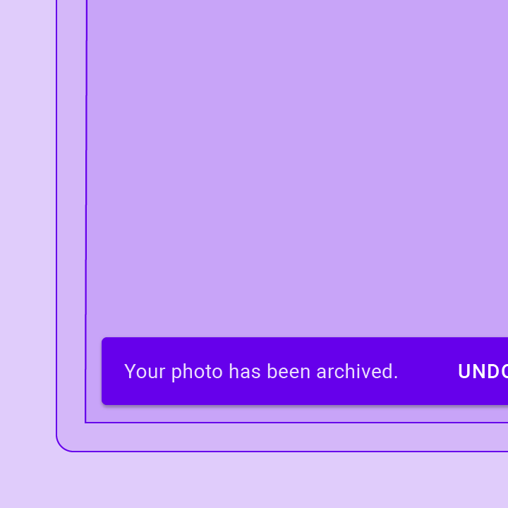
A lightweight message with an optional action which briefly displays at the bottom of the screen.
Information displays
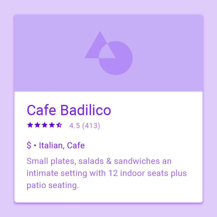
A Material Design card. A card has slightly rounded corners and a shadow.
A Material Design chip. Chips represent complex entities in small blocks, such as a contact.
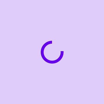
A material design circular progress indicator, which spins to indicate that the application is busy.
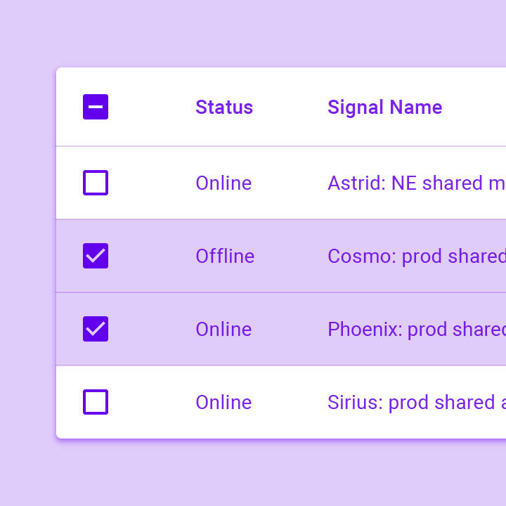
Data tables display sets of raw data. They usually appear in desktop enterprise products. The DataTable widget implements this component.

A grid list consists of a repeated pattern of cells arrayed in a vertical and horizontal layout. The GridView widget implements this component.
A Material Design icon.
A widget that displays an image.
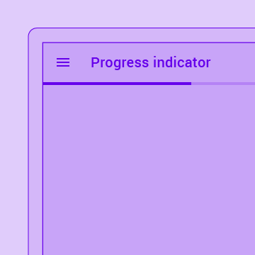
A material design linear progress indicator, also known as a progress bar.
Tooltips provide text labels that help explain the function of a button or other user interface action. Wrap the button in a Tooltip widget to...
Layout
A one logical pixel thick horizontal line, with padding on either side.
A single fixed-height row that typically contains some text as well as a leading or trailing icon.

A Material Design stepper widget that displays progress through a sequence of steps.
See more widgets in the widget catalog.